
Blog
Common Website Mistakes That Cost Businesses Customers
August 9, 2026
Introduction
Have you ever visited a business website and thought, "I do not know where I am supposed to click"?
Maybe the website looks beautiful, but you cannot find the contact number. Or the page takes forever to load. Or you finally find the service you are looking for, but there is no clear way to enquire about it.
You might give it a few seconds, but eventually, you leave.
Now imagine that happening to someone who has just discovered your business for the first time.
This happens more often than businesses realize. A website can look good and still lose potential customers because of small problems that make the experience frustrating. Sometimes the problem is a slow page. Sometimes it is confusing navigation. Sometimes the website simply does not give visitors a clear reason to take the next step.
Your website is supposed to help your business get customers, not send them away.
In this blog, we will look at some of the most common website mistakes that can cost businesses customers and what you can do to fix them.
1. Your Website Takes Too Long to Load
Think about the last time you waited for a website to load. How long did you actually wait?
Probably not very long.
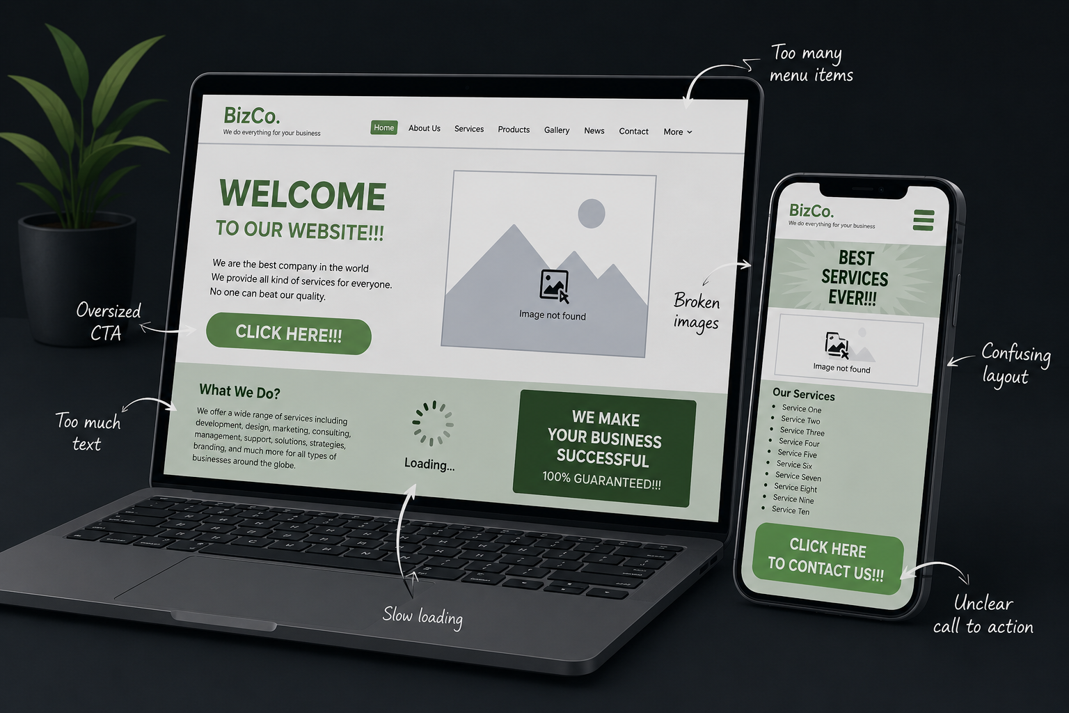
People are used to getting information quickly. If a website takes several seconds to load, visitors may simply close it and look somewhere else. This becomes an even bigger problem on mobile devices, where people may be using mobile data or a slower connection.
A slow website can affect more than the visitor experience. It can also affect SEO and conversions. Large images, too many plugins, poor hosting, unnecessary animations, and unoptimized code can all contribute to slow loading times.
What can you do?
Start by checking your website speed. Compress large images, remove unnecessary plugins, improve your hosting, and reduce elements that do not add much value to the page.
You can also learn more about website speed and its impact on SEO and conversions in our detailed guide.
2. Your Website Is Difficult to Use on Mobile
Now imagine opening your own website on your phone.
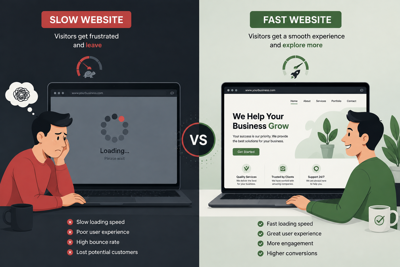
Can you read everything comfortably? Can you tap the buttons easily? Can you find the menu? Can you fill out the contact form without accidentally clicking something else?
If the answer is no, there is a problem.
A website may look perfectly fine on a laptop but feel completely different on a phone. Text can become too small, buttons can be difficult to tap, images can extend beyond the screen, and important information can get buried.
This is why mobile-first web design is so important.
Your website should not simply shrink the desktop version to fit a phone. The experience should be designed with mobile users in mind.
What can you do?
Open your website on different phones and actually use it like a customer. Try finding a product, reading a service page, submitting a form, and contacting the business.
If something feels difficult, fix it.
3. Visitors Cannot Find What They Need
Have you ever landed on a website and had no idea where to go next?
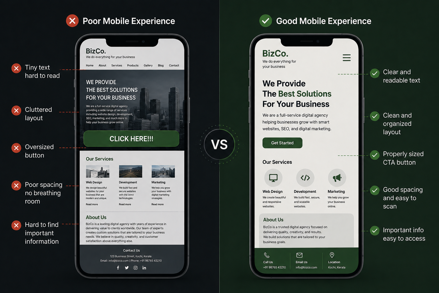
A business may have excellent services, but if visitors have to search through several pages to find them, many will simply give up.
Your navigation should make sense. Visitors should be able to understand what your business does and find important information without having to think too much.
A simple navigation menu might include:
- Home
- About
- Services
- Products
- Portfolio
- Blog
- Contact
The exact structure depends on the business, but the principle is simple: make it easy for people to find what they came for.
4. There Is No Clear Call to Action
Imagine you visit a website because you are interested in a service.
You read the page and like what you see. Then you reach the bottom and there is no "Get a Quote" button, no phone number, and no enquiry form.
What are you supposed to do next?
This is where a call to action becomes important.
A CTA tells visitors what they can do next. It could be:
- Get a Free Consultation
- Request a Quote
- Contact Us
- Book an Appointment
- Shop Now
- Learn More
You do not need a button after every sentence. However, important pages should make the next step obvious.
5. Your Website Has Too Much Information
More content does not always mean a better website.
Sometimes businesses try to put everything on one page because they want visitors to know everything about them. The result can be a huge block of text that nobody wants to read.
Think about how people actually use websites. Most visitors scan before they read. They look at headings, notice images, search for specific information, and decide within seconds whether the page is worth their time.
Break your content into smaller sections. Use descriptive headings, short paragraphs, bullet points, and enough white space.
Your website should answer questions without overwhelming people.
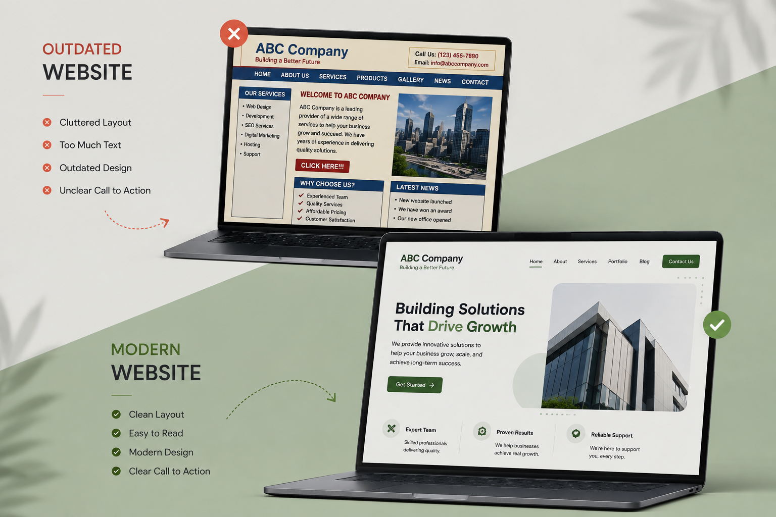
6. Your Website Looks Outdated
Design trends change.
A website that looked modern several years ago may now feel outdated. Old design elements, poor spacing, low-quality images, inconsistent fonts, and cluttered layouts can make visitors question whether the business itself is still active.
This does not mean you need to redesign your website every year.
It simply means your website should still feel current, professional, and easy to use.
Your website is often the first impression people have of your business, so make sure it represents you well.
If you are wondering whether your website actually needs an update, take a look at our guide on signs your website needs a redesign.
7. Your Website Does Not Build Trust
Would you buy from a website that looks suspicious?
Probably not.
Before contacting or buying from a business, people often look for signs that the business is genuine and reliable. Your website should help build that confidence.
You can include:
- Customer reviews
- Testimonials
- Client logos
- Portfolio or previous work
- Business address
- Contact information
- About Us information
- Certifications where relevant
- Clear product or service information
Trust is especially important for businesses that are asking visitors to spend money or share personal information.
A professional website cannot guarantee that someone will become a customer, but a poor website can certainly make them hesitate.
8. Your Contact Information Is Hard to Find
This is a surprisingly common mistake.
A visitor wants to call you, but where is your phone number?
They want to send an email, but where is the email address?
They want to visit your office, but where is your location?
Important contact information should not be hidden.
Keep your contact details easy to find. Your header, footer, contact page, and relevant service pages are all useful places to include them.
For businesses that depend on local customers, this is even more important. Your [local SEO strategy] can help people discover your business when they search for relevant services in their area.
9. Your Website Is Not Optimized for Search
A beautiful website is not very useful if nobody can find it.
Some businesses spend a lot of time designing their website but forget about SEO. Your website should help search engines understand what your business does, what services you offer, where you operate, and which topics you are relevant for.
This involves things such as the following:
- Keyword research
- Page titles
- Headings
- Useful content
- Internal linking
- Image optimization
- Technical SEO
You do not need to stuff keywords into every sentence.
Good SEO starts with understanding what your customers are actually searching for.
If you are new to SEO, you can also read about common SEO mistakes that can hurt your website rankings and learn what to avoid.
10. Your Homepage Tries to Do Everything
Your homepage is important, but it does not need to contain every single thing your business has ever done.
A good homepage should quickly answer a few basic questions:
Who are you?
What do you offer?
Who do you help?
Why should someone choose you?
What should they do next?
From there, visitors can explore your services, products, portfolio, blog, and other pages.
Trying to turn the homepage into your entire website can make it confusing.
This is also why it is useful to understand the difference between a homepage and a landing page
11. Your Website Has Broken Links or Errors
Imagine clicking "Contact Us" and getting a 404 error.
Not a great experience.
Broken links, missing images, forms that do not work, outdated pages, and error messages can quickly reduce trust. They can also prevent visitors from reaching important parts of your website.
The good news is that these problems are usually easy to catch if you check your website regularly.
Try this simple test:
- Click your main buttons.
- Submit your contact forms.
- Open important pages.
- Check your navigation menu.
- Test your website on your phone.
- Look for missing images or broken links.
It sounds simple, but these small checks can prevent a lot of lost enquiries.
12. Your Website Is Not Designed Around Your Customers
This might be the biggest mistake of all.
Businesses often design websites around what they want to say. But your website should be built around what your customers need.
Instead of asking:
"What do we want to put on our website?"
Ask:
"What does our customer want to know?"
That small change in thinking can completely improve your website.
Think about the questions customers ask before buying from you. Then make sure your website answers those questions clearly.
A good website is not just attractive.
It is useful.
How to Know If Your Website Is Losing Customers
You do not always need to wait for someone to complain before realizing there is a problem.
Look at what is happening on your website.
Are visitors leaving quickly? Are people visiting your service pages but not contacting you? Are mobile visitors dropping off? Are important pages receiving very little traffic? Are people reaching your contact page but not submitting the form?
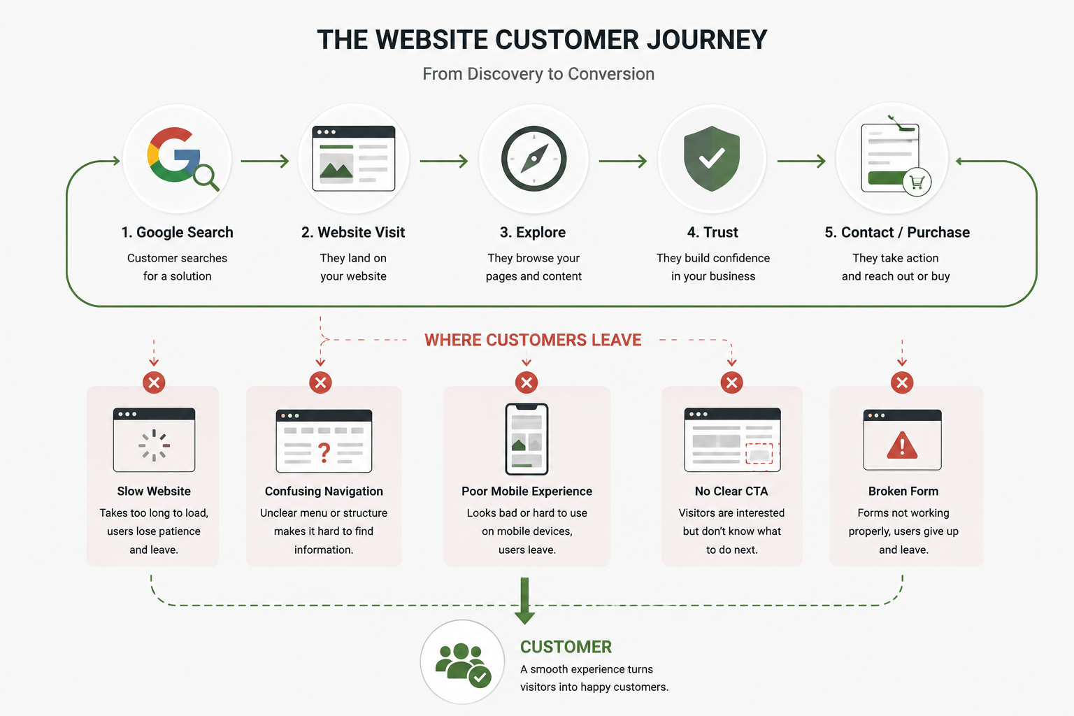
These signs can help you identify where the customer journey is breaking down.
Tools such as Google Analytics, Google Search Console, and website speed testing tools can help you understand what is happening. But numbers are only part of the story.
You should also use the website yourself.
Try to complete the same actions you expect your customers to complete. You may notice problems that analytics alone cannot explain.
Final Thoughts
A website does not have to be perfect.
But it should make things easy for the people using it.
A slow page, confusing navigation, difficult mobile experience, missing CTA, or outdated design might seem like a small problem on its own. Together, they can cost your business real customers.
Your website should help people understand your business, trust you, and take the next step.
If it is doing the opposite, it may be time to take a closer look.
At Konzepta Advertising, we design websites that combine good visual design with usability, responsive development, SEO, and business goals. Whether you need a completely new website or want to improve an existing one, we can help create a website that works better for your customers and your business.
Your website should not just look good. It should help your business grow.